If you're serious about expanding your career in the fitness world then it can't hurt to see how the pros are doing it. Here are the 50 best personal training websites from 2016.
Yes, they look great, but a good-looking website will only get you so far. These fitness sites are built using tried and true principles of online marketing that will help you generate leads and increase your sales.
Each of the following personal training websites offers something unique that sets it apart from the others. Take a look at each, get inspired, and then apply these tactics to your own fitness site today!


Kate's website is a perfect example of the power of self-branding. Personal photos of her family help create a connection with her website visitors.

A minimalistic design with beautiful photography make Christine's fitness site look like a work of art. Plus, her fitness videos are impossible to miss - That's Business 101 and Christine's site does it very well!
Amy's website has some real business savvy - Her "featured products" are prominently displayed and have consistent branding across each.

There's no mistake what Megan offers: "Your Guide to Shop, Cook, & Eat Plant-Based" pops out, letting visitors know they're in the right spot.
A great website makes it clear what value is being offered and who this value is intended for
This is one fitness website that is designed to build an email list. Check out all the great opt-in offers that are strategically placed across the site.

"Make people hot" or "Get people huge" - Which option describes your fitness goal. These two simple choices make it simple for visitors to find what they need.

Erin's fitness website is another prime example of what it takes to build an email list. Notice her 2 calls-to-action that are found "above the fold" on the home page.

A neat feature of Elliot's site is the "sticky" menu bar that stays with you as you scroll down the page. Talk about easy navigation at your fingertips!

One word about Jade's website: Testimonials! He uses a home page slider to display some convincing testimonials from past clients. He's building trust and credibility right off the bat.

Christina's site is an excellent example of how to make social media stand out. With a dedicated menu bar at the top of her page, visitors can't miss the opportunity to connect with her socially.
Ask yourself, "What would I do if I landed on my website for the very first time?"

Matt April does an amazing job of bringing his fitness content front and centre. There's something for everyone in many of his "Bent On Better Posts" section on the home page.

WildHIIT
Great imagery makes Wild HIIT a fierce-looking fitness website. Combine a roaring lion with ripped fitness photos and it's hard to imagine anyone NOT wanting to jump into a HIIT workout!

A big, beautiful slideshow on the home page shows off Jamel's fitness level and athleticism. Plus, the moves he's showing off make exercise look fun...you don't have to work out in a stuffy gym, right?

Jill offers a wide range of health and fitness resources and services, so it would be easy for her website to become overwhelming. Instead, she's done an excellent job of keeping navigation simple and user-friendly.
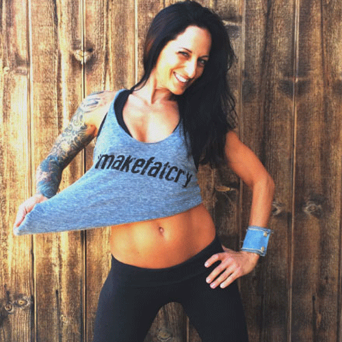
Bree (a.k.a. The Betty Rocker) has a fun personality and it's captured right away on her website. Who wouldn't want to hang out with her...and buy her fitness programs?

Talk about a clear offer: "20 minutes, 20 days, 20 inches" - Brett's website leaves no room for guessing. If you want to lose weight in less time, you're in the right place.
A professional website uses professional photos. Don't skimp on your pics - Get a pro to help

Adam is a natural in front of the camera, so it makes sense that he use video to do some "personality marketing" on his website. Check out his home page video - It's top-quality.

Joel really builds credibility for himself by prominently displaying media outlets that have featured his work. It's hard to argue with someone who has appeared in so many reputable places in the media.

Sure, they're ripped now, but how did the Harrison Twins get their start? Just watch their simple interview-style video that explains their story. This is a great way for their site visitors to "get to know them" on a personal level.

A really neat feature on Josh's site is the scrolling before and after photo near the bottom of the home page. Josh has transformed his own body, so it makes sense that he can help others do the same.
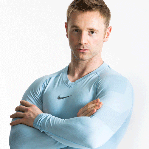
Scott lays a big claim as the "World's leading online personal trainer" but then backs up his authority with a long list of publications where his work has appeared. Once again, it's all about building credibility.

Lucas uses a fun and welcoming image of himself on the homepage along with an inviting tagline: "Your new coach" - He instantly establishes a potential business relationship with everyone who lands on his site.
Who is your target audience? Does your website instantly make them feel like they're home?

Mark's website definitely breaks the mould of that used by most personal trainers. Just check out his call-to-actions..."How Do I Become a Ninja?"
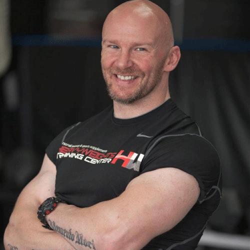
Rob's personal training website is another great example of a lead generation tool. Land on his home page and you have one option: Download a lead magnet (and therefore get on his mailing list!)
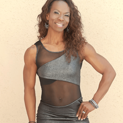
Kimberly uses her experience as a figure competitor to set herself apart from other personal trainers. Her website illustrates how her personal fitness success makes her a trustworthy expert in the field.

This website is designed to sell. Just take a look at the "above the fold" section on Mike's home page: All of his best-selling products are right there waiting to be ordered.
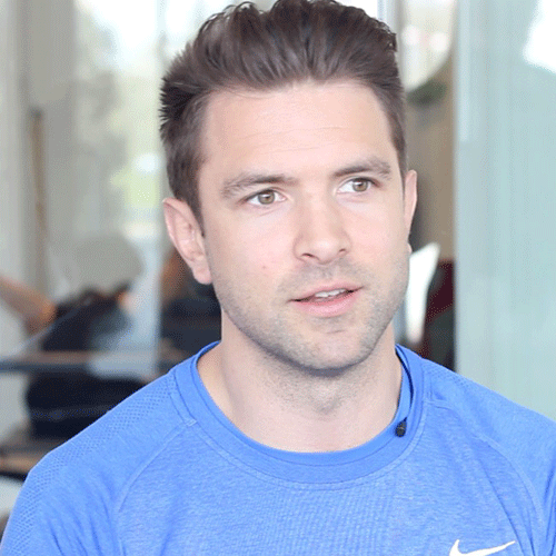
A unique auto-play full-width video is a great attention-grabber on this fitness site. It displays many ways they can help clients get fit and shows a wide range of client demographics they work with.

Front and centre is "The Team" you'll work with at Barry Stephen Fitness. Since personal training can be quite an intimate experience, it's key that prospective clients feel warmly welcomed and comfortable with their potential trainers.
Nothing conveys your personality like a video. If your site doesn't have video, get to work on one now
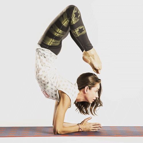
Sidebars sometimes become website wastelands - They're there, but they serve no purpose. Not in this case! Check out how Strala displays class schedules, special offers, and purchase buttons all in one convenient sidebar.

"Make Success Mandatory" - It's hard to argue with Jeremy's call-to-action that leads visitors to download his e-book. Building an email list for future marketing endeavors is crucial and Jeremy is doing it right.

Justin uses an entire playlist of videos for his website visitors to watch as soon as they land on his fitness site. You can't beat video for showing off your personality and passion!

Image sliders are pretty common on websites these days, but Natalie has one that is so slick and artsy - You have to take a peek.
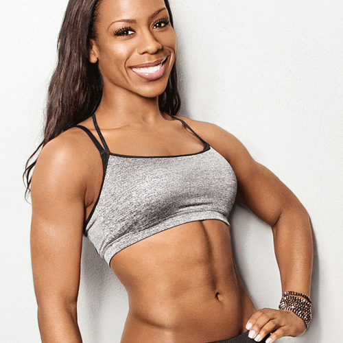
Nicole's website features a homepage slider full of photos and tips she's had published in various fitness magazines. New visitors will quickly realize that she is a personal trainer who can be trusted as a reliable voice in the fitness industry.

Liv's site take minimalism to a whole new level, and it works! The white background makes her photos (and navigation choices) really stand out.
Show why you are an authority. What have you done to earn the trust of new clients?

Tabata training is intense, so it makes sense that Kathy's site kicks off with some sweat-dripping exercise photos from one of her classes. This is why people sign up with her...they want to get to work!

By forcing people to stop on her home page, Kelly exposes her site visitors to images of healthy eating options and a comfy photo of herself. This primes visitors for what they can expect to find inside her site.
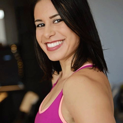
You can't be much more straight-forward than Lisa. Her "Train with me" contact form on the home page makes it super-simple for anyone to get started right away.
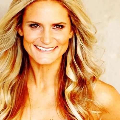
Lauren's website is perfect example of lifestyle marketing. Her background videos are full of family, fun, and healthy smiles. Who wouldn't want to work with a coach who obviously has something figured out.
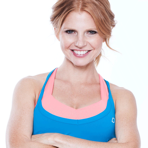
Sara's website does an excellent job of drilling down to her target niche right of the bat. "Real Moms. Real Workouts. Real Life." This is a safe and inviting environment for moms who want to get in shape.

A good personal trainer is more than just an instructor. He is an inspirational leader. Chris understand this and leads off his website with a quote that will inspire prospective clients to take action.

Michael's fitness website is a great example of how to blend monetization strategies seamlessly. New visitors are offered training programs, supplements, and even branded merchandise. A good website has to sell, and this one does.

What do most customers want to do before they buy? They want to TRY! That's why Operation Fit Moms offers a FREE trial class (complete with child care) - They understand their target consumer!
If your website isn't generating revenue, what's the point of having a website at all?
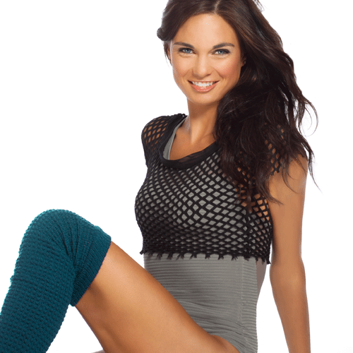
The Internet is overrun by websites offering the same old promises. Amanda offers some convincing reasons that she's different: "Transform your body for 31 cents per day!"...even the most price-conscious consumer has to take a second look at that offer!

Before and after photos galore, testimonials, and lots of "get to know Natalie" videos make this website one that visitors can relate to and connect with. Plus, there's lots to buy directly from the website, making impulse purchases more likely.
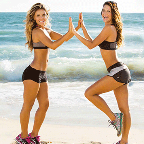
The girls at Tone It Up are doing more than just offering fitness programs and new recipes - They are building a fitness community that's driven through their website. With almost 300k members, they're doing something that people obviously like!

Tony's tagline, "Because heavy things won't lift themselves" is a great way to attract his target (likely male) audience. The black and red colour scheme further emphasizes that this is a place for guys to hang out.
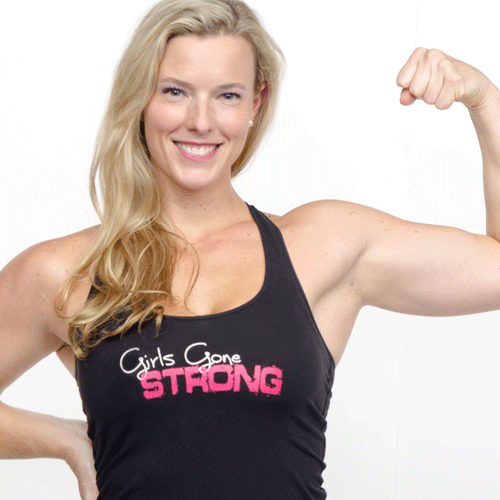
An "exit intent" pop-up is one that appears when a visitor's mouse leaves the page. Check out how Girls Gone Strong is using this pop-up technique to generate more leads.

Many people like the idea of doing fitness with a team versus having to do it alone. See what happens when you click "Join Our Team" - Caroline's site makes it easy to connect and get started with her team.
People want to connect and be part of a community. Make sure your website offers this opportunity
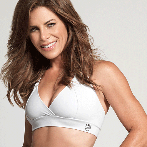
No surprises here. Jillian's website is well-designed from a business-generation perspective. See her unique lead capture technique on the home page that offers a "customized" fitness solution.

The XNRG Fit site makes the process of getting started so simple: Just follow the 5 steps conveniently laid out on the home page. Each step is linked to the appropriate page or resource, making it super-simple for anyone to follow along and get to work.
Did We Miss Any Great Personal Training Websites?
This list includes 50 personal training websites that we love, but it's not an exhaustive list by any means. If we missed a great site, just let us know in the comments section below. We'd love to hear which PT sites are your favourites!


