There’s no doubt that being a personal trainer requires good communication skills and the look of your website gives your future client a good idea of it. That being said, it’s easy to build a functional website, but creating an aesthetic, memorable website, and most of all adapted to the personal training industry is harder to achieve. If you’re looking for inspiration, below is a list of personal trainer websites that rock the web in 2015.
1. Jill Brown Fitness
http://www.jillbrownfitness.com

If you’re looking for a website that inspires fitness, body balance and healthy lifestyle, Jill Brown Fitness’ website is a perfect example : pastel colors with light images for a refined style. Her dynamic website makes it also a nice navigation experience for any visitor.
2. Ulisses World
 We can’t pass by Ulisses’ website and not pay attention to his video clip. Ulisses is a bodybuilder and a personal trainer who’s not afraid to use videos and pictures of himself to catch people’s attention. And we have to admit it : it works.
3. Hughes Fit
Another bodybuilding coach that knows how to stand out from the crowd, with an impressively professional website.

The logo is simple but memorable, easily customizable, and a nice and wide home page slideshow covers the whole top of the page. Finally, a white header bar appears and keeps the menu visible when you scroll down.
4. 20 minute body
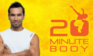
20 minute body is a workout program created by Brett Hoebel. Brett Hoebel’s website is a good example of an awesome and efficient website : you’ll immediately feel the positive energy and dynamism that comes out of the top banner.
Tweet : “Brett Hoebel’s website is a good example of an awesome and efficient website.”
Apart from that, it contains pretty much all the infos the visitor needs to know to trust the product and take action : Brett’s media references, a 5-star testimonial, a video presentation, a call-to-action message and button, inspirational Before/After videos, and clear product packages.
5. Jessie Pavelka
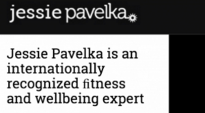
Jessie Pavelka made it very simple but effective : his website can be summarized in a short one-pager containing his bio and his contact information. A picture of himself on the right adds a little mystery to it all… Jessie Pavelka’s website is a perfect example of a nice-looking and professional design for personal coaches that don’t want to spend time or money on a multi-page website.
Tweet : “Jessie Pavelka : a simple but effective website.”
Learn how to get your website selling for you with this 5-step process shared by the personal trainer Dave Smith (@MYBWfitness) : 5 Steps to Get Your Personal Training Website Selling For You.
6. Adam Cobb
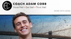
There’s a lot to tell about this website of Adam Cobb, nutritional consultant : the website’s background design, colors and images, the 3D effect on some pictures, not to mention the positive energy brought by the header image on the home page… It gives it a very modern, cool and optimistic look. The original touch : the short videos that accompany every post on his blog.
7. Joelharper
http://www.joelharperfitness.com/
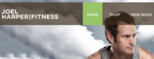
One of the nice things with that website is Joel’s creative pictures. Apart from that Joelharperfitness.com is a good example of classic but clean and complete website, including also an online shop.
Tweet : “Joel Harper’s website : a good example of classic but clean and complete website.”
8. Push beyond training
http://pushbeyondtraining.com/

A scrolling text on the head banner, dynamic images and buttons : pushbeyondtraining.com is a website you can take a good inspiration from if you’re looking to build a dynamic website that’s also social media oriented.
9. Harrison Twins

Harrison Twins’ website is a nice example of creative design : the Rocky-like header image, the logo, the black and white colors, the big caps catchwords… all of that gives it a movie style. Aside from that, it’s hard not to entertain the visitors with their short video clips.
Tweet : “Harrison Twins’ website : a nice example of creative design.”
10. Louise Hazel
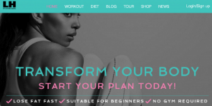
Another website design that literally rocks it out. It’s creative, modern, and elegant at the same time : an out of the box header image, with a round call-to-action button that we can barely miss, music graphics to illustrate the buttons… Louisehazel.com sure plays in the big leagues.
Over to you! Which one do you like most? Share your opinion below.
Want your own website but don’t know where to start? Have a look at this complete resource on how to build your own amazing website.


